CSS Layouts Flexbox and Grid
- Both Flexbox and Grid are new layout modules that can be used to create layouts that are more advanced than previous techniques.
- While they share some similar syntax and some of the same properties, they each have their own specialties.
- With Flexbox, items are aligned on a single axis. It is often described as being one-dimensional. While you can set the main axis to arrange items as rows or columns, Flexbox only deals with one dimension at time.
- Grid layouts are thought of as two-dimensional, because it can arrange items into rows and columns at the same time.
- While both of these methods can be used for layouts, Flexbox is great for space distribution of items within the same axis. Grid is ideal for layouts that require more control with rows and columns.
Flexbox
https://developer.mozilla.org/en-US/docs/Web/CSS/flex
- flex container: the parent element
- flex items: the child elements
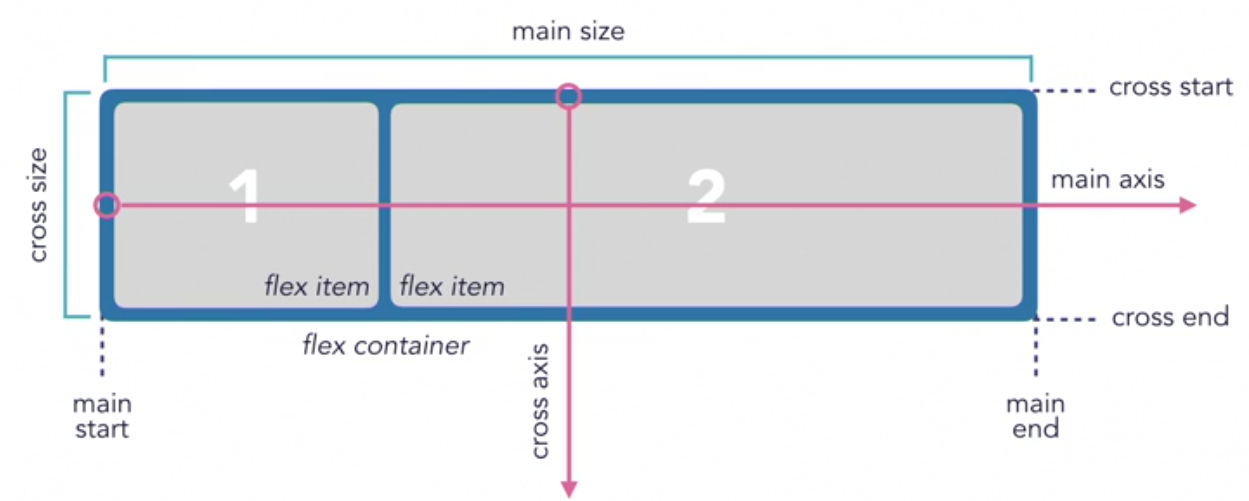
flex-direction
- Determines the direction of the main axis
There are four values: row, row-reverse, column and column-reverse.
flex-flow Shorthand
/* shorthand */
flex-flow: column wrap;

/* longhand */
flex-direction: column;
flex-wrap: wrap;<section class="flex-container">
<div>
flex item
<div>not a flex item</div>
</div>
<div>flex item</div>
<div>flex 1tem</div>
<div>flex item</div>
</section>.flex-container {
background: lightgray;
margin-bottom: 10px;
width: 500px;
height: 200px;
display: flex;
/* OR */
display: inline-flex;
flex-wrap: wrap;
/* OR */
flex-wrap: nowrap;
/* OR */
flex-wrap: wrap-reverse;
flex-direction: column;
}
.flex-item {
box-sizing: border-box;
border: 1px solid blue;
padding: 10px;
width: 100px;
}flex- Properties
These must be applied to the flex items directly not to the container.
flex-basis: sets the initial size of the flex-itemsflex-grow: determines how items will expand if there is extra space in the containerflex-shrink: determines how items will shrink if there isn’t enough space in the container
flex Shorthand
flex: grow shrink basis;
flex: 0 1 100px;
If you wanted the items to be sized differently, then flex must be applied to the individual flex items.
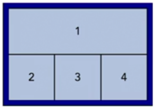
<div class="flex-container">
  <div class="flex-item-first">1</div>
  <div class="flex-item">2</div>
  <div class="flex-item">3</div>
  <div class="flex-item">4</div>
</div>
.flex-container {
display: flex;
}
.flex-item-first {
flex: 0 0 100%;
}
.flex-item {
flex: 1 1 auto;
}Alignment
- justify-content aligns items on the main axis
- align-items aligns items on the cross axis
.box {
  display: flex;
  align-items: center;
  justify-content: center;
}
/* Basic keywords */
align-items: normal;
align-items: stretch;
/* Positional alignment */
/* align-items does not take left and right values */
align-items: center; /* Pack items around the center */
align-items: start; /* Pack items from the start */
align-items: end; /* Pack items from the end */
align-items: flex-start; /* Pack flex items from the start */
align-items: flex-end; /* Pack flex items from the end */
/* Positional alignment */
justify-content: center; /* Pack items around the center */
justify-content: start; /* Pack items from the start */
justify-content: end; /* Pack items from the end */
justify-content: flex-start; /* Pack flex items from the start */
justify-content: flex-end; /* Pack flex items from the end */
justify-content: left; /* Pack items from the left */
justify-content: right; /* Pack items from the right */
/* Baseline alignment */
/* justify-content does not take baseline values */
/* Normal alignment */
justify-content: normal;
/* Distributed alignment */
justify-content: space-between; /* Distribute items evenly
The first item is flush with the start,
the last is flush with the end */
justify-content: space-around; /* Distribute items evenly
Items have a half-size space
on either end */
justify-content: space-evenly; /* Distribute items evenly
Items have equal space around them */
justify-content: stretch; /* Distribute items evenly
Stretch 'auto'-sized items to fit
the container */Grid
https://www.mozilla.org/en-US/developer/css-grid/
-
Grids are broken down into evenly spaced columns and rows that are used as a guide for laying out page components.
-
Gutters are often included to add consistent spacing between columns.
-
Page components are arranged within the columns.
-
grid container - the parent element.
-
grid items — the child elements within the grid container
<div class="grid-container">
  <div class="grid-item">
    <div>Not a grid item</div>
  </div>
  <div class="grid-item"></div>
  <div class="grid-item"></div>
</div>
.grid-container {
display: grid;
/* OR */
display: inline-grid;
}-
When using the value of grid, unless specified, the items will span the width of its container.
-
When using the value of grid, the container will be displayed as block-level element and stacked on top of other block element.
-
When using the value of inline-grid, the items will span the width of its content.
-
When using the value of inline-grid, the whole container will display inline next to other inline containers.
-
Grid lines are the horizontal and vertical lines that divide the grid into columns and rows.
- Grid lines are also used to determine the position of the grid items and are referred to by a numerical index, or by custom name.
- When using a numerical index, both the vertical and horizontal grid lines start at one.
- Grid lines can also be referred to by a negative numerical index which allows you to reference the opposite end of the grid.
-
A grid cell refers to a single unit, defined by where the grid row and column intersect.
- The space between two adjacent grid lines is the grid track, which is basically the columns and rows.
-
Grid tracks can optionally be separated by a gutter.
Explicit Grid
- To define a specific number of grid lines and tracks, use
grid-template-columnsandgrid-template-rows. This will create an explicit grid.
.grid-container {
  display: grid;
  grid-template-columns: 100px 100px 100px; /* 3 columns */
  grid-template-rows: 100px 100px; /* 2 rows */
}
The Fraction Unit: Fr
grid-template-columns: 1fr 1fr 1fr;
grid-template-columns: 1fr 2fr 1fr;
grid-template-columns: mixmax(200px, 1fr) 2fr 1fr; /* Set minimum allowed size */
repeat()
- We can also define multiple tracks using another value, the repeat function.
- Instead of writing 1 fr three times, include the number of tracks, three in this example, followed by a comma and the size of the track such as 1 fr within the parentheses.
repeat([number of tracks], [size of tracks])

grid-template-columns: 1fr 1fr 1fr;
/* same as */
grid-template-columns: repeat(3, 1fr);
grid-template-columns: 50px repeat(2, 1fr);
Adding Gutters with gap
gap: 10px; /* rows & columns */
gap: 10px 20px; /* rows | columns */

/* valid */
gap: 20px;
gap: 16%;
gap: calc(19% + 20px)

/* not valid */
gap: 1fr

/* shorthand */
gap: 110px 20px;

/* longhand */
row-gap: 10px;
column-gap: 20px;- The original grid layout specification included the grid-gap, grid-row-gap and grid-column-gap properties.
- It has been updated to gap to be used for both grid and Flexbox.
/* shorthand */
gap = grid-gap

/* longhand */
row-gap = grid-row-gap
column-gap = grid-column-gap
Implicit Grid
- When using a grid layout, grid template rows and grid template columns are used to define a fixed number of tracks to form an explicit grid. But sometimes you may have more grid items than the number of explicit tracks.
- Once an explicit grid is filled or if no explicit grid has been defined, the grid container will generate implicit grid tracks.
- If you don’t know how many items your grid needs to display you can create the whole grid using only an implicit grid, and if you know the minimum amount of grid items you could use an explicit and implicit grid together.
grid-auto-columns grid-auto-rows .grid-container {
  display: grid;
  grid-auto-columns: repeat(3, 1fr); /* 3 columns */
  grid-auto-rows: 100px 100px; /* 2 rows */
}
Defining the grid Structure
.grid-container {
  display: grid;
  grid-template-columns: 100px repeat(2, 1fr);
  grid-template-rows: 100px;
  grid-auto-rows: 200px;
  grid-auto-columns: 50px;
}
Positioning grid Items
grid-column = grid-column-start grid-column-end grid-row = grid-row-start grid-row-end .grid-item-1 {
  grid-column-start: 2;
  grid-column-end: 4;

  /* shorthand */
  grid-column: 2 / 4;
  grid-column: 1 / -1; /* span from start  */

  grid-row-start: 1;
  grid-row-end: 3;

  /*shorthand */
  grid-row: 1 / 3;
  grid-row: 1 / span 3;
}
Grid Lines and grid-column
.grid-item-1 {
  grid-column-start: 2;
  grid-column-end: 4;

  /* shorthand */
  grid-column: 2 / 4;
}

.grid-item-1 {
  grid-column-start: 2;
  grid-column-end: 4;
  grid-row-start: 1;
  grid-row-end: 3;

  /* shorthand */
  grid-column: 2 / 4;
  grid-row: 1 / 3;
}
Alignment
- justify-items defines the default justify-self for all items of the box, giving them all a default way of justifying each box along the appropriate axis.
- align-items aligns items on the Block Axis within their grid area.
- place-items is shorthand property allows you to align items along both the block and inline directions at once (align-items and justify-items properties).
.grid {
  display: grid;
  grid-template-columns: repeat(auto-fill, 50px);
  align-items: center;
  justify-content: center;
  justify-items: stretch;
}- justify-content aligns items on the inline axis of a grid container.
- align-content sets the distribution of space between and around content items along grid’s block axis.
- place-content is shorthand property allows you to align content along both the block and inline directions at once (align-items and justify-items properties).
Naming the grid columns/rows
body {
  grid-template-columns: [left] 1fr [middle] 1fr [right] 1fr;
}
header {
  grid-column: left / right;
}
grid-template-areas
The grid-template-areas CSS property specifies named grid areas, establishing the cells in the grid and assigning them names.
<section id="page">
  <header>Header</header>
  <nav>Navigation</nav>
  <main>Main area</main>
  <footer>Footer</footer>
</section>
#page {
display: grid;
width: 100%;
height: 250px;
grid-template-areas:
"head head"
"nav main"
"nav foot";
grid-template-rows: 50px 1fr 30px;
grid-template-columns: 150px 1fr;
}
#page > header {
grid-area: head;
background-color: #8ca0ff;
}
#page > nav {
grid-area: nav;
background-color: #ffa08c;
}
#page > main {
grid-area: main;
background-color: #ffff64;
}
#page > footer {
grid-area: foot;
background-color: #8cffa0;
}